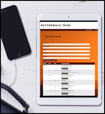
Mobile use jumping for class registration and everywhere else
Those who pay attention to such things expect this holiday season to be the one in which mobile ecommerce spending leaps over desktop spending. According to GetApp, a directory for SaaS and Cloud Applications like class registration software, “Mobile spending has been steadily on the rise for the last few years, and this 2017 is expected to be the first year that mobile sales will be bigger and greater than desktop sales  revenue.” Instead of using our PCs or laptops to make online purchases, we’re more likely to buy Uncle Rex a mustache guard while standing in line at the coffee house.
There is no denying mobile is becoming a big dog in the kennel. TechCrunch, a technology news source, says just under $2 billion in Back Friday sales this year by consumers came via mobile devices. That’s a lot of people tapping their smartphones and tablets. TechCrunch says, “Purchases made on mobile devices have so far totaled a record 36.9 percent of all sales, and 54.3 percent of all site visits.”
These numbers again underline the importance of a pleasant user experience, even for companies that are not selling wireless speakers, or something called Fingerlings, which kids allegedly really want this Christmas. If your web pages are responsive—which means they automatically fit the screen size of the device—you’re making it easier for your audience to do what they need when they’re ready.
 Even with class registration software, mobile use represents a steadily growing chunk of registrations, which makes user-friendly, responsive pages and forms essential. Learning Stream’s page themes are mobile friendly. But within that structure, it is also important to consider other factors. For example, don’t insert tables with fixed widths on your pages. Set them to be a certain percentage, like 50% of the page size instead of, say, 2,000 pixels, so they always look good on the screen.
And though photos and large graphics automatically re-size in Learning Stream, also consider how they will look on other pages under your control, too.
Also, it’s usually easier for a user to swipe up and down than to click for more information.
Those are a few examples of how to keep your users’ mobile experiences top of mind. If you have others you want to share, of if you have questions about class registration software, please use the form below.
